GEO Orthodontics
Branding
Strategy
Visual Identity
Art Direction
Brand Toolkit
Brand Guidelines
Social Media Creative
Fix up. Look sharp.
Dentist’s and Orthodontics don’t always have the greatest rep. A single bad experience from one customer can be the catalyst for a downturn in customer conversions. GEO understand this and this is where GEO’s point of different lies. Customer experience is at the heart of every journey and it is expected to be flawless.
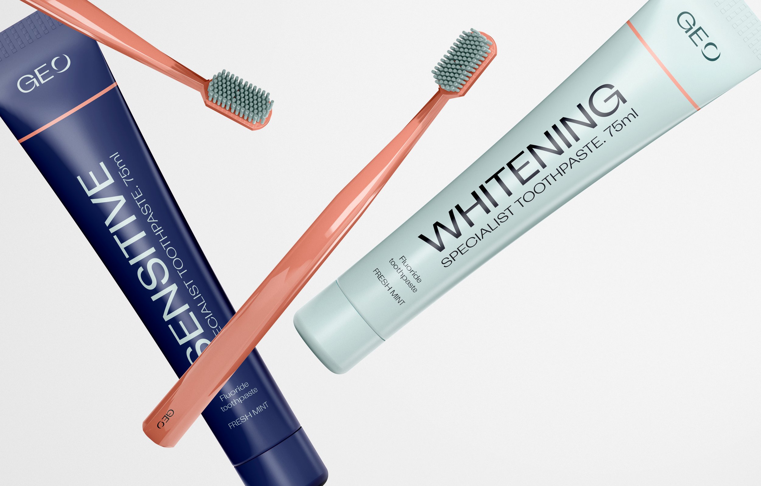
Working in partnership with marketing agency Fabulatte, delivering the data, we were asked to take a stale, copy and paste brand creative and move it towards the consumer who were younger, more affluent and image conscious. The market place was full of copycats and pop-up direct to consumer brands. Our task was clear, design a brand that provided the GEO experience representation. During our discovery sessions, it was apparent we had to execute the core values of what was already being delivered on site across the Orthodontics existing practices; High-end quality service and exclusivity.
A brand for building on and on.
We knew if GEO was to be successful and communicate with its intended target audience, typography was going integral to hit the sweet spot. One of the challenges we faced was putting in place a brand identity and guideline that could manage physical business location growth. Our solution was a unique set of identity lock-ups supported with a classy, premium type pairing.
Exclusive experience.
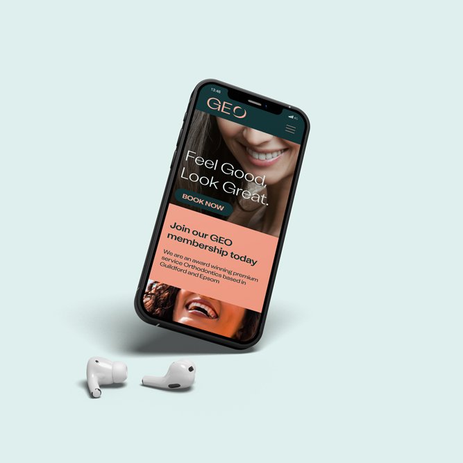
With the dental practice being over subscribed, this provided a grate opportunity to change how this was communicated. In-keeping with the premium offering, the old no-fills waiting list became an exclusive membership for an increased level of service.
Exclusive experience.
With the dental practice being over subscribed, this provided a grate opportunity to change how this was communicated. In-keeping with the premium offering, the old no-fills waiting list became an exclusive membership for an increased level of service.
Hand over, not hand off.
The final delivery of brand work for GEO provided identity use documentation all the way to conceptual web design implementation. This was packged in a toolkit that allowed for the supporting teams to implement the brand across its physical and digital locations at their own pace. A perfectly packaged brand product that is ready to go right out the box.
Going direct to the consumer?
Accelerate your brand growth with best-in-class creative that matches your ambitions. Get in touch


